Summary (TL;DR)
A 12 percentage point reduction in abandonment on the highest-friction onboarding screen. Clearer setup guidance. Early signs of reduced support demand.
By rethinking how new members install and activate their Miles Tracker devices, I helped By Miles deliver a more human, reassuring, and data-driven onboarding experience. The work also reshaped how the company approaches experimentation and cross-functional problem solving.
Background: By Miles and the Tracker That Powers Pay-Per-Mile Insurance
By Miles is a UK-based car insurance company that helps people who drive less, pay less. Members pay an annual upfront fee to stay insured while parked, then a variable monthly cost based on their actual miles driven.
To track those miles accurately, each member receives a Miles Tracker, a small device about the size of a matchbox that plugs into their car’s OBD-II port. Once installed and activated, it automatically sends mileage data to the By Miles app, so members can see trips, costs, and driving insights in real time.
The app’s onboarding flow is therefore pivotal. It bridges the gap between purchase and first real-world use, a moment where clarity and reassurance can make or break trust.
The Challenge: Tackling Early-Stage Drop-Off
The Senior Product Manager identified a critical moment of friction, the period between purchasing a Miles Tracker policy and completing the first trip.
Most new members followed our in-app onboarding journey, giving us a rare opportunity to build confidence early. Yet, 6–10% of policies were cancelled within 30 days due to comprehension issues, meaning members simply didn’t understand how the policy worked.
Our goals were ambitious but focused:
- Reduce 30-day comprehension cancellations.
- Improve onboarding completion rates and setup speed.
- Encourage early app adoption and engagement.
- Reduce support contacts from new members.
Mapping the Post-Purchase Experience
To understand the problem’s full scale, I co-facilitated a workshop with colleagues from Product, Marketing, Dev, CX, and Compliance.
What started as an app-specific review quickly turned into a revelation about the entire post-purchase ecosystem. I discovered friction not only in the onboarding flow but across:
- Post-purchase emails and printed collateral.
- App Store and Play Store messaging.
- Welcome, login, and account verification in-app screens.
- The physical installation of the Tracker itself.
The challenge wasn’t a single broken step. It was a fragmented experience stretching across multiple touchpoints.
Finding the Friction: What the Data Revealed
To explore the problem space further, I turned to our analytics to uncover where members were dropping off. One metric leapt out:
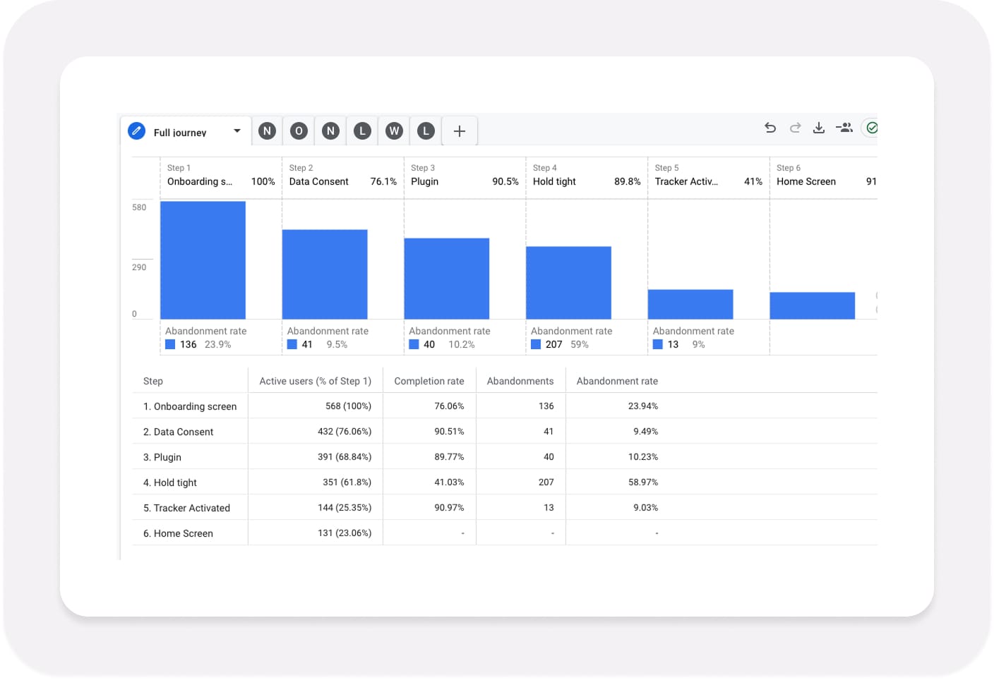
59% of members were abandoning the flow on the “Hold tight” screen.
That screen was supposed to reassure members that their Miles Tracker was activating. Instead, it was the point where over half simply gave up.
Something about that message, “Sit back, relax, and have a cuppa”, wasn’t working.
Sitting in Our Members’ Driving Seat
To understand why so many members were dropping off, I combined first-hand experience with a deeper review of the full post-purchase journey.
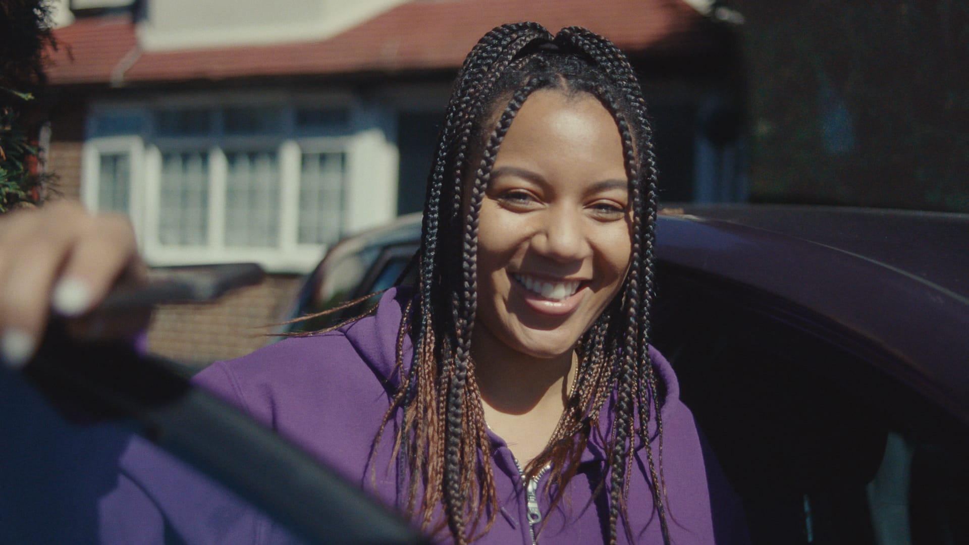
I ordered a Miles Tracker, waited for it to arrive, and went through onboarding like any new member would, sitting in my car on a rainy morning, phone in hand. The light wasn’t terrible, but it was dim enough to make certain steps awkward, a realistic reminder that not every installation happens in ideal conditions.
That moment behind the wheel helped bring to life what the data and CX insights had already been hinting at. Across my discovery work, I uncovered recurring friction points that made installation more confusing and emotionally charged than intended:
- Difficulty locating the OBD-II port, often hidden behind panels or tucked under the steering column.
- Installing in low light or poor weather, making it physically harder to locate or remove compartment covers, particularly when ports were concealed.
- Unclear technical terms, such as “LED” instead of “flashing light”, which clashed with our plain-English tone.
- Limited out-of-hours support, leaving those installing before 9 a.m. and after 5 p.m. without real-time help.
- Poorly timed or overly severe system messages, such as penalty warnings arriving before members had any way to ask for reassurance.
The combination of these issues painted a clear picture: this wasn’t just a UI problem, it was a service-level challenge affecting every touchpoint, physical, digital, and human.
Experiencing the journey firsthand gave me empathy for the stress and uncertainty members felt, while the broader discovery confirmed that this stress was systemic, not situational. Together, they provided the clarity needed to reframe the problem around confidence, not just connection.
From driveway to dashboard: documenting the real-world experience of installing a Miles Tracker and discovering first-hand where friction and confusion arise.
Going Undercover: Testing the Support Experience
To understand how support factored into the onboarding journey, I went a step further and contacted our Customer Experience team anonymously via live chat, posing as a new member who was struggling to activate their Tracker.
The results were eye-opening. While the first response arrived within 30 seconds, the language used created new friction rather than resolving it. Phrases such as “black box” and “LED light” surfaced, despite being terms I deliberately avoid for clarity and compliance reasons.
As a company that proudly won a Plain English Award in 2018, I take great care to communicate using plain, simple, and accessible language. In this instance, a friendlier term such as “flashing light” or “blinking light” would have been clearer and more reassuring for members who are less familiar with technical jargon.
When the conversation paused for more than eight minutes midway through, I experienced the same frustration many members would feel — a moment of uncertainty with no progress indicator or fallback option.
Later, I received an extension cable in an unlabelled bag with no explanation of how to use it, forcing me to search YouTube for help. This reinforced a critical gap: our digital and human touchpoints weren’t working in unison.
These findings revealed that even with a well-designed interface, inconsistent language, tone, or handovers could undermine confidence just as much as a broken flow.
From Discovery to Definition
After auditing the full end-to-end experience, I discovered that new members had to progress through 11 to 13 app screens before even reaching the first Miles Tracker onboarding or activation step. This included multiple welcome screens, login and verification flows, and biometric setup prompts, all before any meaningful progress toward the core task of installing their Tracker.
It was clear the problem wasn’t just about design quality, but about focus and sequencing. To move forward, I broke the broader challenge into five clear, manageable problem statements:
- Balancing efficiency and education in onboarding.
- Reducing anxiety and uncertainty during activation.
- Guiding members to the app for installation and activation.
- Enhancing support accessibility and consistency.
- Tailoring onboarding to different levels of tech confidence.
Each was reframed using techniques like abstraction laddering and inversion, helping us articulate why the problem mattered.
I then defined UX success metrics, including onboarding completion rate, Time to Value (TTV), and improved app-store sentiment, linking them directly to By Miles’ OKRs around profitability, ease, retention, and sales.
Ideation and Early Testing
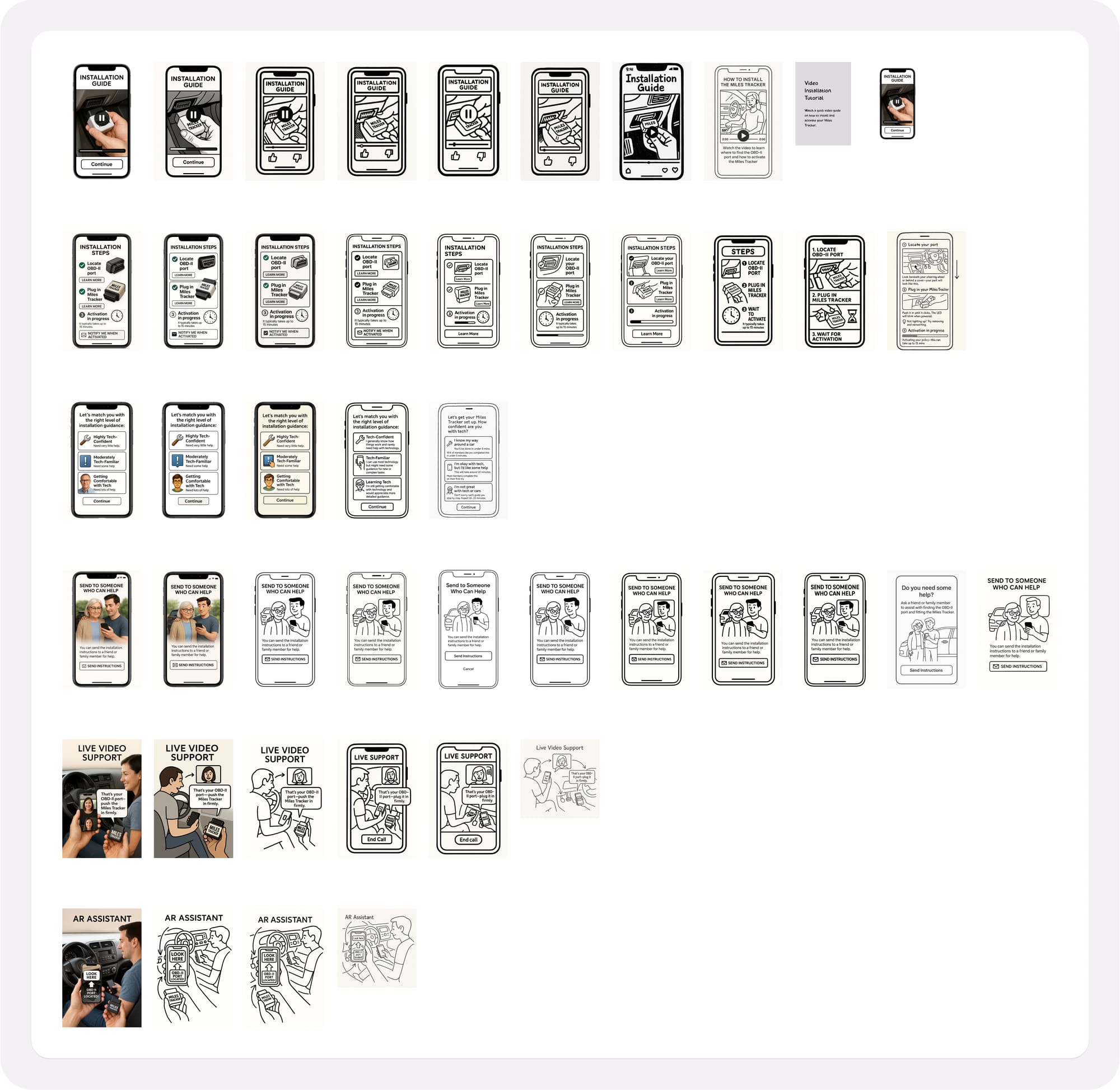
I developed ideas ranging from simple enhancements like video tutorials to ambitious innovations like AR-assisted port location and live video installation support.
Each was documented with a clear description, hypothesis, and measurable success criteria.
To prioritise, I ran Sacrificial Concept Testing, sharing deliberately rough concepts to spark honest reactions without attachment to fidelity.
I initially hand-sketched everything, but then experimented with Generative AI to visualise early ideas. It was a valuable experiment, though in truth, I spent hours chasing perfection that wasn’t needed.
If I were to do it again, I’d still use AI, but timebox it ruthlessly and trust my design instincts sooner.
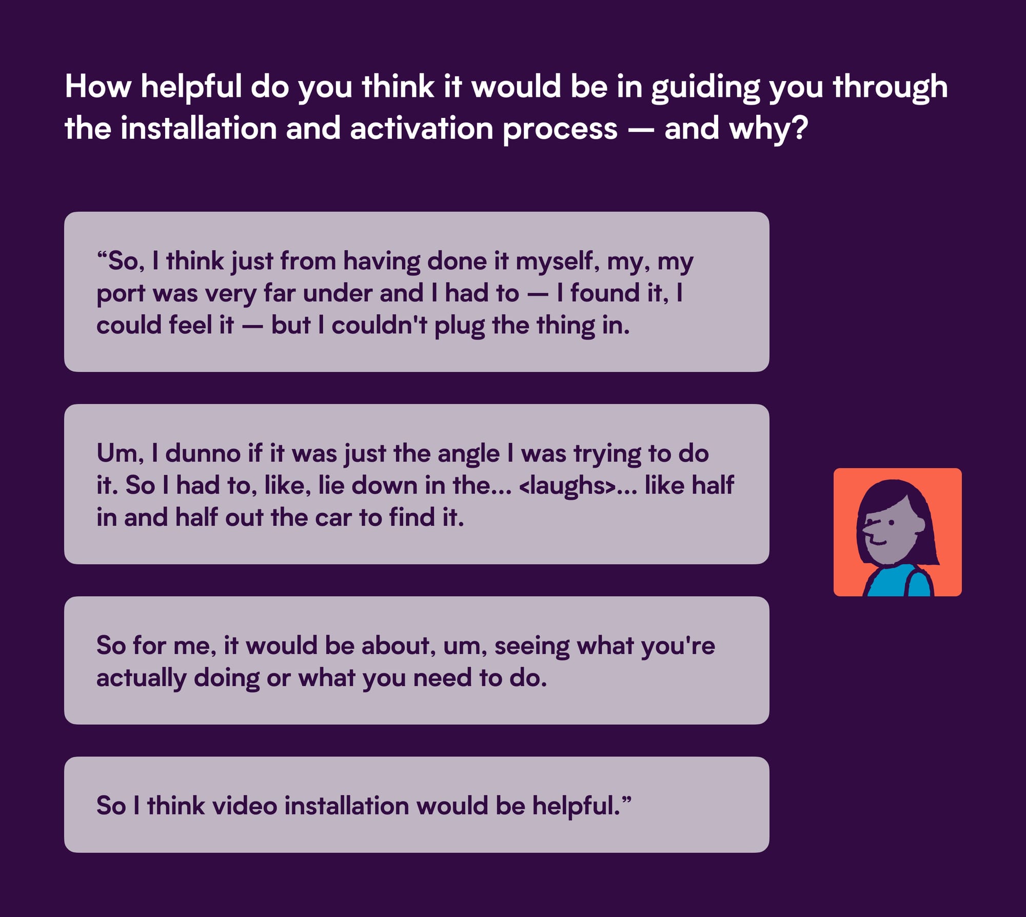
Testing with Real Drivers
Using UserTesting, I ran a remote, unmoderated study with six participants split into two cohorts:
- Cohort 1: Drivers with less than 25 years’ experience
- Cohort 2: Drivers with 25 years or more
Across both groups, several insights stood out:
- Video tutorials were the most preferred format. They built confidence and allowed users to learn at their own pace.
- Live video support was valued as a backup rather than a starting point, building trust through human reassurance.
- Text-and-image guides were functional but less engaging.
- AR support split opinion. Some loved the idea, others doubted its reliability.
- Choice overload increased friction. Personalisation worked only if it felt effortless.
The results gave us a clear direction, clarity, control, and reassurance were non-negotiable.
Prototyping and Iteration
I then created low- to mid-fidelity prototypes focused on each of the five problem statements, iterating through two rounds of user testing before handing over refined designs to our Product Designer for high-fidelity UI work.
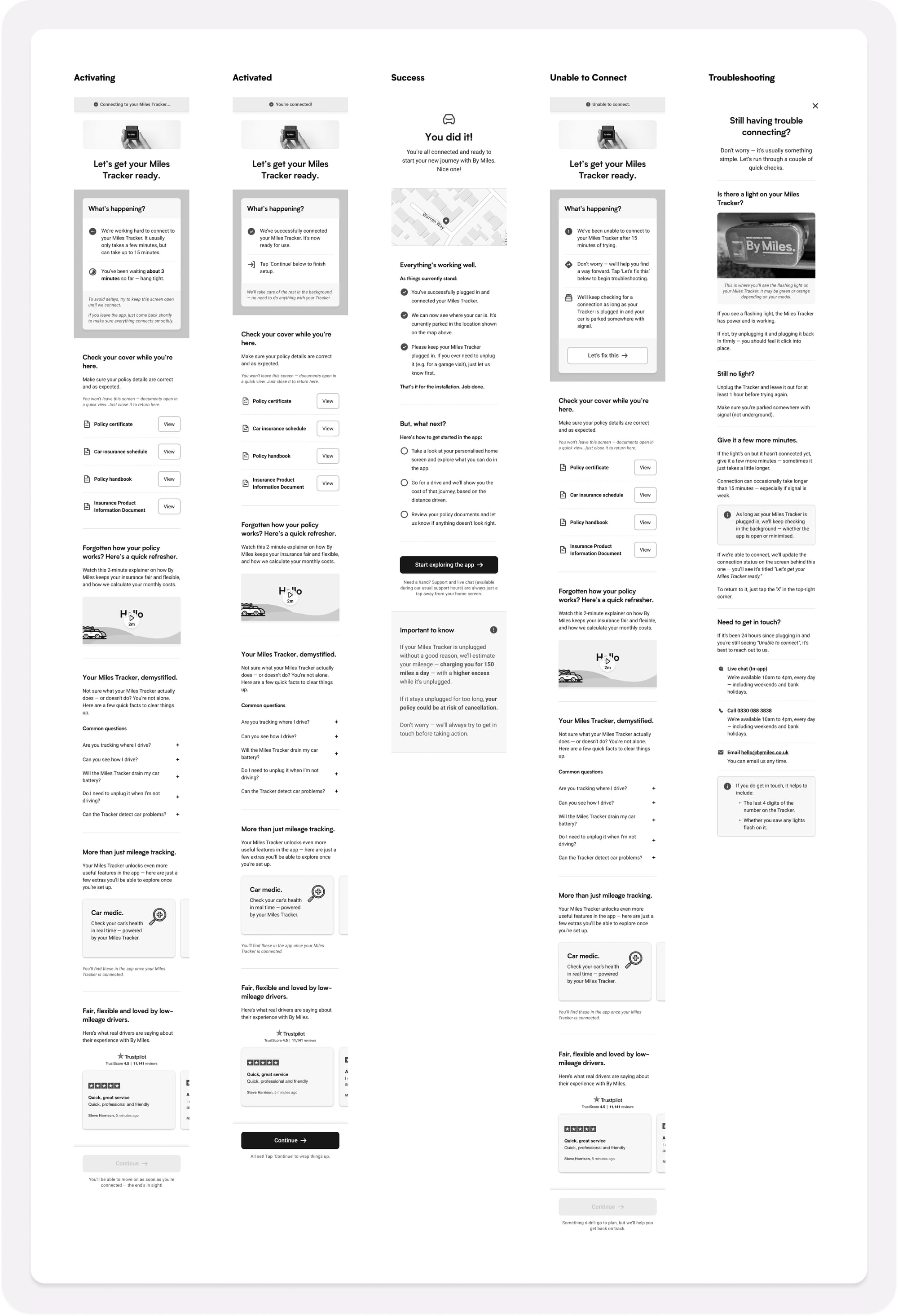
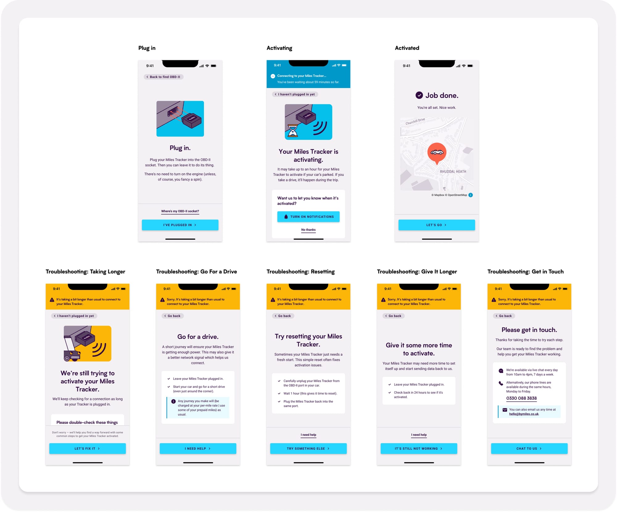
One of the biggest breakthroughs came from the “Hold tight” screen. I renamed it to the more action-orientated title of “Connecting…” and redesigned it around transparency and reassurance.
Research showed that:
- Real-time progress updates such as “You’ve been waiting X minutes” built trust.
- Short, focused content performed better than scrollable screens.
- Visual celebration moments like tick icons and simple animations created emotional closure.
- Maps showing live location helped confirm the Tracker had connected.
In essence, simplicity created confidence, and flexibility created trust.
From Concept to Continuous Improvement
Once validated, we began rolling out the new experience incrementally from June 2025.
Rather than a “big-bang” launch, I championed a continuous improvement approach, allowing us to monitor results, gather data, and refine as we went.
This shift in release strategy marked a wider cultural change. We stopped treating onboarding as a static journey and began treating it as a living, measurable system.
Impact and Reflection
The results spoke clearly:
- Abandonment from the former "Hold Tight" screen fell by around 12 percentage points, from the high-50s to the mid-40s, a relative reduction of nearly 20%.
- Onboarding completion times improved, as clearer messaging helped members reach activation faster.
- Support sentiment improved, with CX reporting fewer repeat queries and clearer understanding.
Macro-level results were more nuanced:
- Comprehension-related cancellations dipped by roughly 0.3 points quarter-on-quarter but remained largely stable year-on-year.
- Support requests within 30 days of purchase dropped by around 6–7% compared with the previous quarter, although seasonality muted longer-term trends.
Overall, the redesign improved clarity, tone, and user confidence, even if structural issues, such as pre-purchase messaging and hardware reliability, continued to shape the bigger picture.
This experience highlighted a key truth: UX design can move the needle, but lasting impact requires cross-functional alignment.
The project also highlighted how service and product experiences must be designed together. My “secret shopper” tests showed that terminology, support handovers, and after-hours availability were just as influential on user confidence as the in-app design itself.
Learnings and What I Would Do Differently
This project was as much about empathy and process as it was about pixels. It taught me how deeply human experiences can be shaped by small, systemic details.
If I could do it again, I would:
- Bring Marketing and CX into discovery earlier.
- Pair analytics with longitudinal research to track confidence over time.
- Timebox AI use for concept generation.
- Focus on system- and service-level fixes beyond the interface.
What I would absolutely do again:
- Experience it myself, end-to-end, nothing beats first-hand empathy.
- Use sacrificial concepts to spark early, honest feedback.
- Champion incremental releases over big reveals.
This project reminded me that great onboarding isn’t about screens or devices.
It’s about helping people feel confident, capable, and cared for from the very first moment.