Summary (TL;DR)
- Problem: Endoscope reprocessing was slow, fragmented, and error-prone. Technicians lacked a clear, centralised way to track priorities.
- Approach: Shadowed technicians, mapped workflows, ran remote ideation workshops (Crazy 8s, dot voting), and sketched wireframes.
- Inspiration: Kitchen display systems, GTD productivity methodology, and technician feedback.
- Impact: Created low-fidelity wireframes for an “Endoscopy Hub” to streamline tasks and highlight urgent cases.
- Deliverables: Low-fidelity wireframes, innovation framework, and strategic roadmap for validation, iteration, and UI build.
The McDonald’s Moment
Sometimes, inspiration strikes in unexpected places.
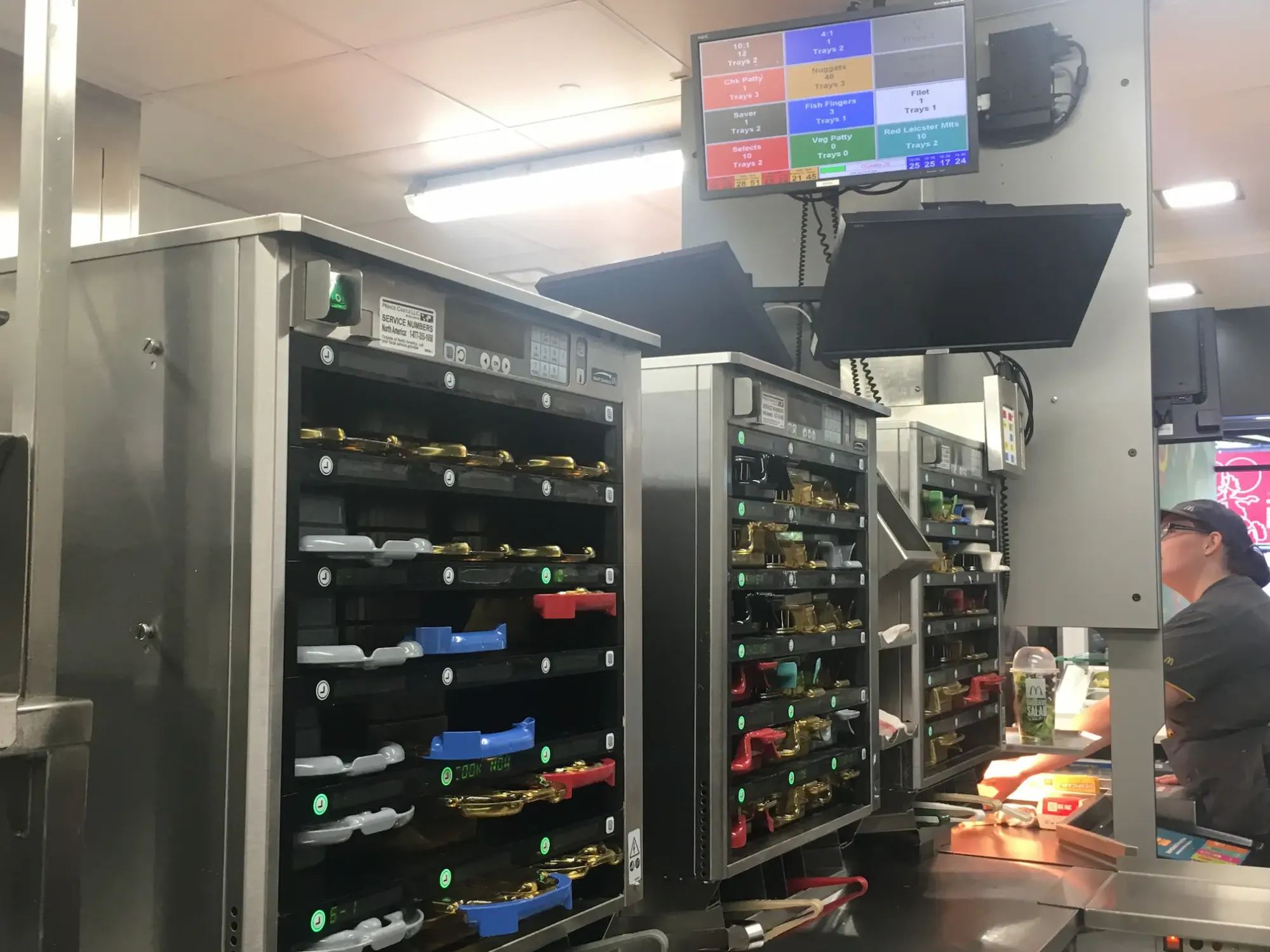
On a lunch break at McDonald’s, waiting for my Quarter Pounder, I noticed the kitchen display system showing orders in progress. Simple, clear, actionable. Suddenly it clicked: this is what endoscopy technicians need. A real-time, glanceable “Hub” for managing complex, high-stakes workflows.
That lightbulb moment became the seed for the Endoscopy Hub - a project I began while designing at STERIS, a global leader in surgical instrument reprocessing.
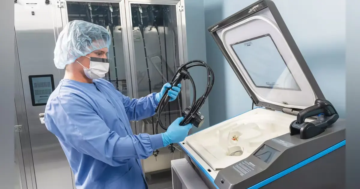
The Challenge: Inefficient Endoscopy Workflows
Technicians in hospitals face enormous pressure to manage the reprocessing and tracking of endoscopes. Existing systems were fragmented, requiring constant manual checks and slowing down workflows. Errors weren’t just inconvenient - they could impact patient safety.
This was a classic healthcare UX problem: technicians under pressure, systems too fragmented for true workflow efficiency.
But how could a complex medical workflow be simplified without losing critical detail?
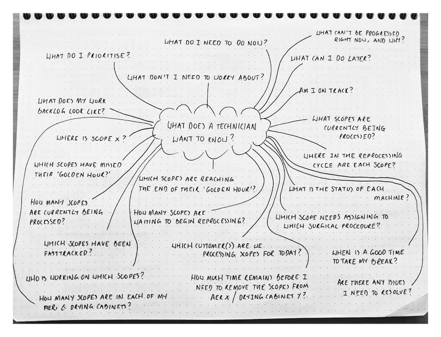
The Research: Shadowing Technicians and Mapping Pain Points
To understand the reality on the ground, I:
- Conducted in-depth interviews with reprocessing staff.
- Shadowed technicians across hospitals to observe workflows.
- Analysed error rates and delays in existing systems.
The insights were clear: technicians needed clarity, prioritisation, and efficiency.
The next step was to explore what a solution could look like.
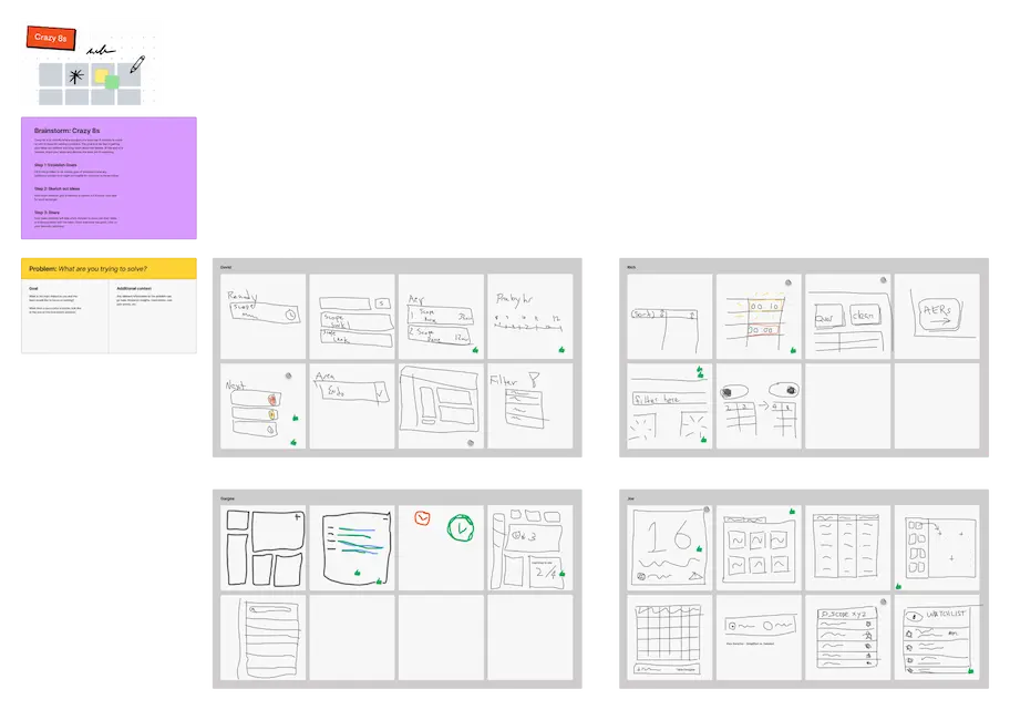
The Ideas: From Hub Concept to Crazy 8s
The initial concept was a centralised Endoscopy Hub - a single interface where technicians could see everything at a glance.
To generate ideas, I facilitated remote brainstorming sessions using FigJam, including:
- Crazy 8s sketching to quickly explore design directions.
- Dot voting to identify the most promising ideas.
- Theme mapping to group concepts into opportunities.
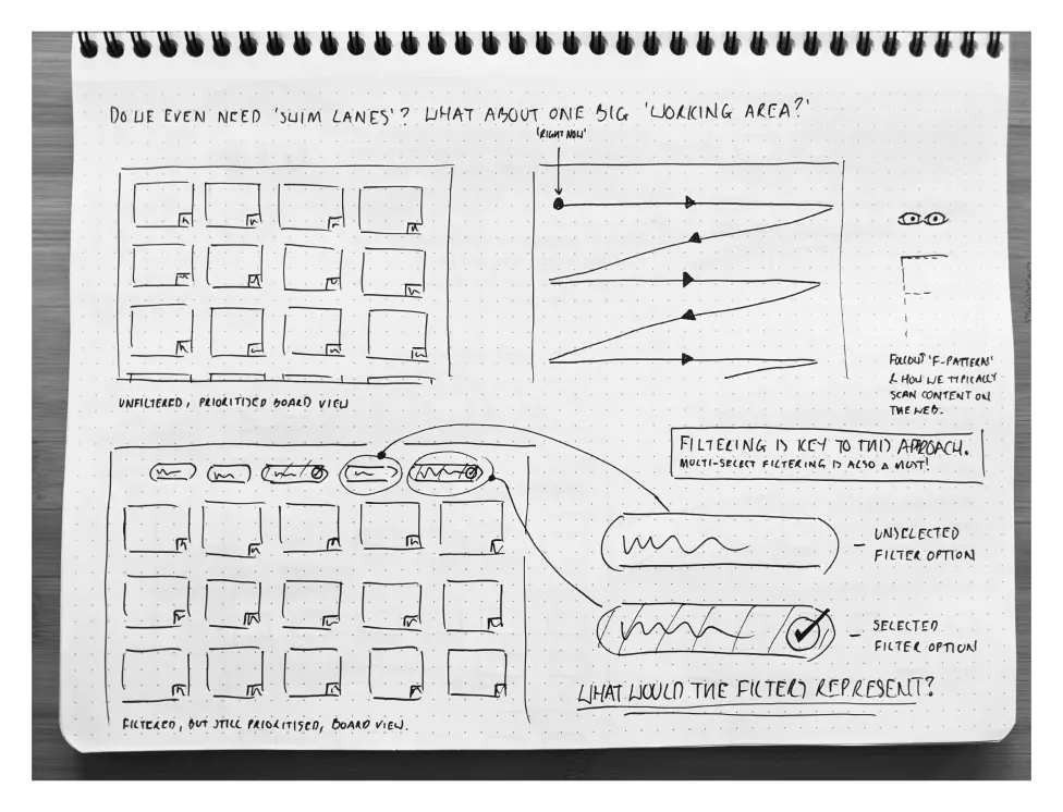
This produced a wide range of ideas, from priority task swimlanes to dynamic tiles that echoed real-world task management.
But where would the best inspiration come from?
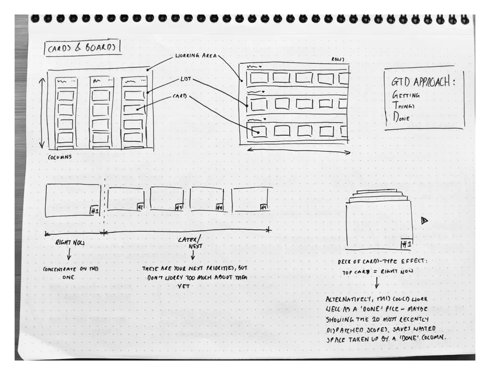
The Inspiration: Kitchen Displays, GTD, and McDonald’s
That McDonald’s “a-ha” moment gave me a metaphor: treat technician workflows like kitchen orders. Clear, glanceable, and action-oriented.
I combined this with two other inspirations:
- Kitchen Display Systems (KDS): already proven in fast-paced, high-volume environments.
- Getting Things Done® (GTD): a methodology for breaking complex work into “Now, Next, Soon.”
These influences shaped the wireframes into something both intuitive and efficient.
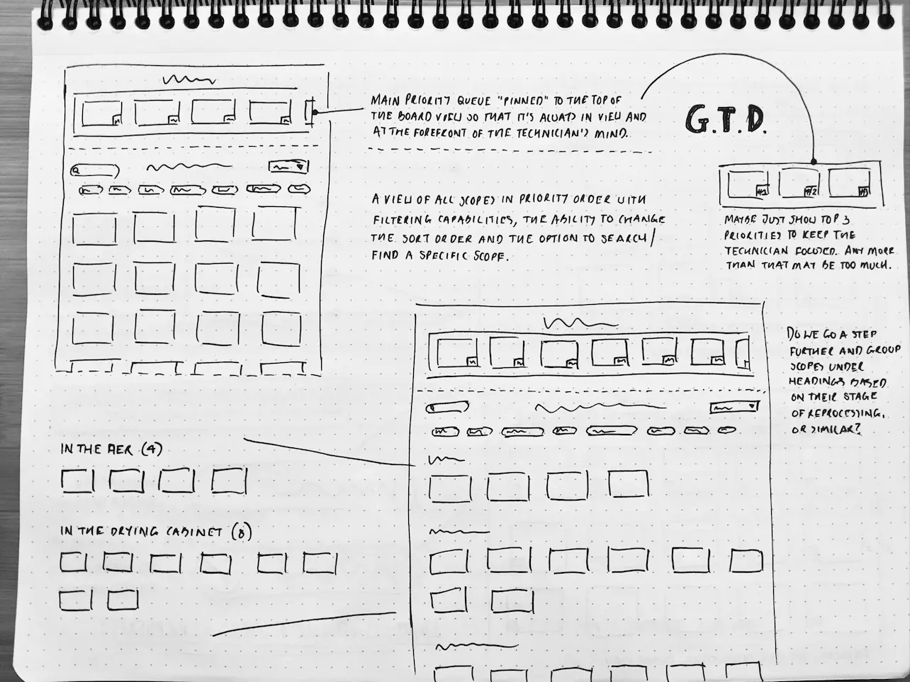
The Designs: From Paper Sketches to Wireframes
I began with Sharpie sketches on dot grid paper to keep ideas fluid and fast. Early iterations explored:
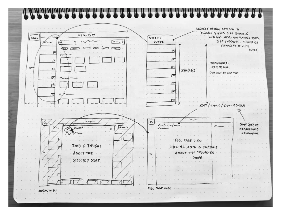
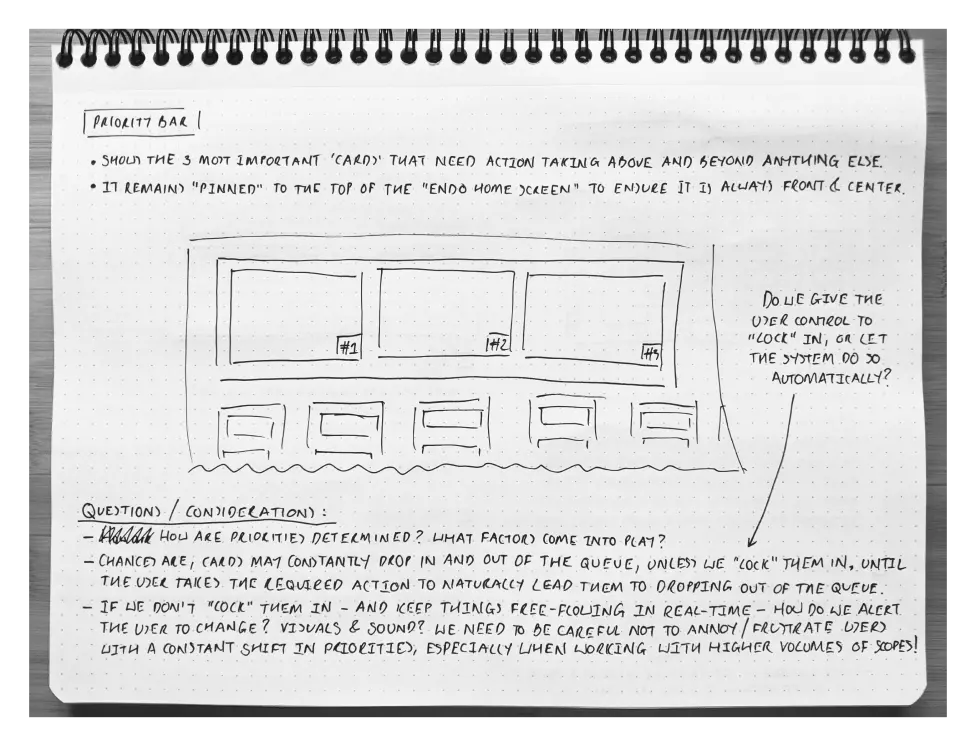
- Priority columns (Now, Next, Soon).
- Live tiles showing endoscopes awaiting reprocessing.
- Swimlanes to cluster tasks by urgency or status.
I then moved into Whimsical to refine the wireframes digitally, creating layouts that balanced glanceability with depth of information.
I then moved into Whimsical to refine the wireframes digitally, creating layouts that balanced glanceability with depth of information. These wireframes established a clear direction for the next phase.
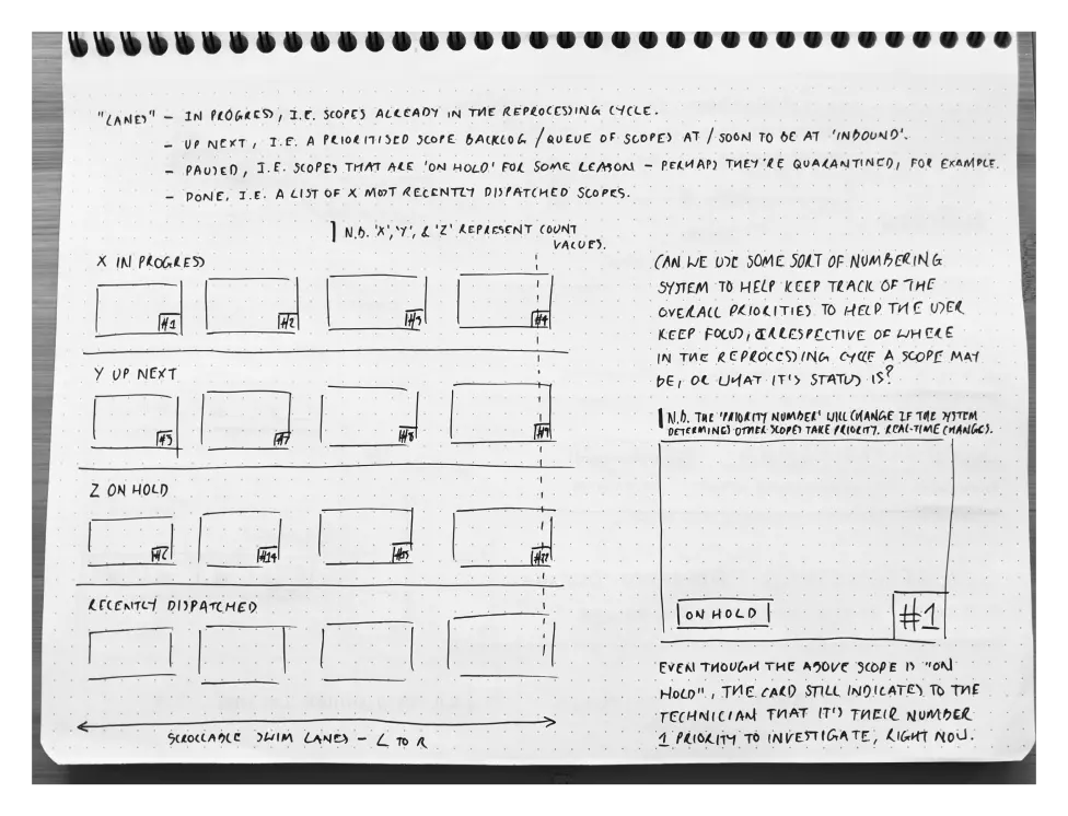
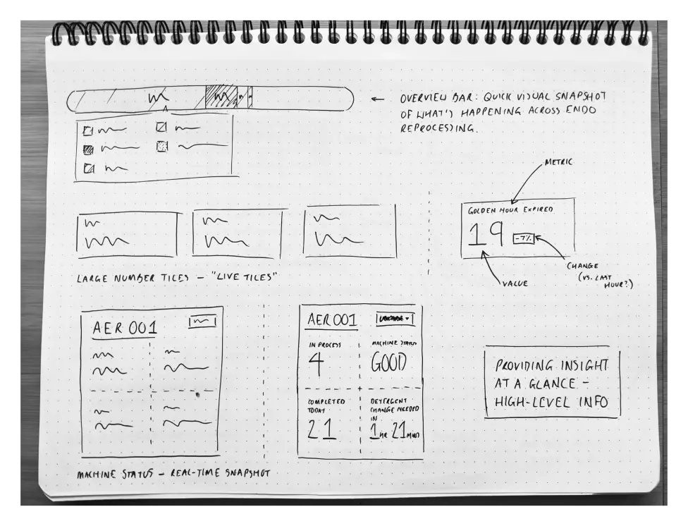
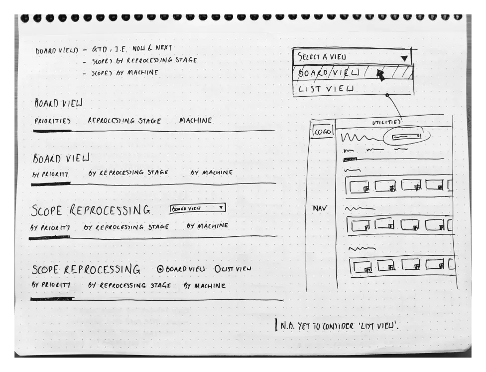
First digital wireframe iterations explored card-based layouts, live tiles, and technician-centric swimlanes.
Discovery Phase Deliverables
This discovery phase equipped the STERIS team with:
- Low-fidelity wireframes showing the Endoscopy Hub concept.
- Design principles rooted in user shadowing, GTD, and KDS innovation.
- Positive stakeholder feedback recognising the efficiency potential.
- Strategic roadmap for validation, iteration, and UI transformation.
The foundation was set for taking the Hub from concept to implementation.
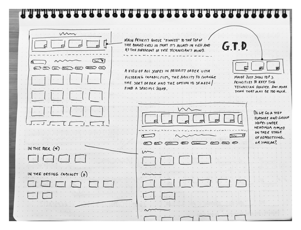
Second iteration wireframes refined the Hub into a glanceable, tile-based interface aligned with technician workflows.
Discovery Phase Impact
During the Endoscopy Hub discovery phase, I delivered:
- User insights from shadowing technicians and analysing workflow inefficiencies.
- Collaborative ideation outputs (Crazy 8s, dot voting, theme mapping) that reframed features into opportunities.
- Inspiration framework from kitchen display systems and GTD methodology, applied to healthcare UX.
- Low-fidelity wireframes (Sharpie + Whimsical) showing card-based UI, live tiles, and prioritisation columns.
- Positive stakeholder feedback, setting a roadmap for validation, iteration, and UI transformation.
The Natural Next Steps
The logical progression from discovery to implementation would include:
- User validation with technicians to refine pain points and priorities.
- Iterative refinement of wireframes into higher-fidelity prototypes.
- UI transformation for clinical environments (high-contrast, accessibility-compliant).
- Integration testing with hospital systems to measure impact on efficiency and error reduction.
Conclusion: Discovery Anywhere, Impact Everywhere
The Endoscopy Hub demonstrates how user-centred discovery can be applied to healthcare workflows just as effectively as in ecommerce or insurance.
This project proved that inspiration can come from anywhere—a McDonald's display, a productivity framework, or a shadowing session in a busy hospital. The key is connecting those dots into solutions that reduce complexity, empower users, and create measurable impact.
Innovate, don’t imitate. Even in healthcare.