The Headlines
A 12 percentage point reduction in abandonment on the highest-friction onboarding screen. Clearer setup guidance. Early signs of reduced support demand.
I diagnosed a confidence problem that extended far beyond the app — spanning post-purchase emails, packaging, support interactions, and in-car installation. Through funnel analysis, first-hand testing, and prototype validation with real drivers, I redesigned the onboarding flow and championed a continuous improvement approach that changed how By Miles releases and measures product changes.
Background
By Miles is a UK-based pay-as-you-go car insurance company. Each member receives a Miles Tracker — a matchbox-sized device that plugs into their car and automatically logs every mile driven. Getting members successfully through app onboarding isn't just a UX concern; it's a commercial one. Before this project, 6–10% of policies were cancelled within 30 days.
A Narrow Brief. A Broader Opportunity.
The brief was specific: reduce drop-off between Miles Tracker purchase and first trip. The goals were commercially grounded:
- Reduce 30-day comprehension-driven cancellations.
- Improve onboarding completion rates and setup speed.
- Drive early app adoption and engagement.
- Reduce support contacts from new members.
What I didn't yet know was how far beyond the app the problem actually stretched.
The Problem No Single Team Owned
I facilitated a cross-functional workshop to map the full post-purchase experience. What began as an app-specific brief quickly expanded — friction wasn't confined to the onboarding flow. It ran across:
- Post-purchase emails and printed collateral.
- App Store and Play Store messaging.
- Welcome, login, and account verification in-app screens.
- The physical installation of the Tracker itself.
The challenge wasn't a single broken step. It was a fragmented experience that no single team owned.
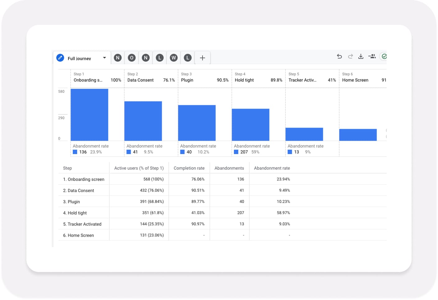
One Metric. One Screen. 59% Abandonment.
I dug into the analytics to find where members were dropping off. One metric leapt out:
59% of members were abandoning the flow on the “Hold tight” screen.
That screen was supposed to reassure members their Miles Tracker was activating. Instead, it was the point where over half simply gave up.
Something about that message — "Sit back, relax, and have a cuppa" — wasn't working.
Sitting in Our Members’ Driving Seat
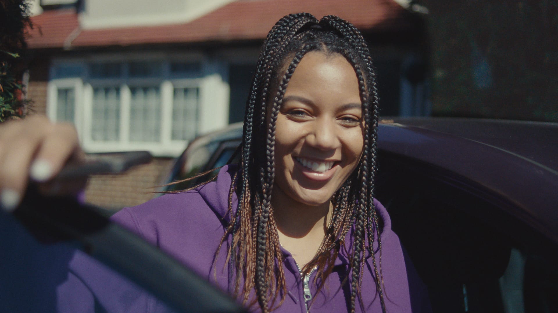
I ordered a Miles Tracker and went through onboarding exactly as a new member would — sitting in my car on a rainy morning, phone in hand. The light was dim enough to make certain steps awkward.
That first-hand experience, combined with CX insights and discovery research, uncovered friction points that made installation more confusing and emotionally charged than members deserved:
- Difficulty locating the port the Tracker plugs into, often hidden behind panels or under the steering column.
- Installing in low light or poor weather, making physical setup harder than expected.
- Unclear technical terms — "LED" instead of "flashing light" — clashing with By Miles' plain-English tone.
- Limited out-of-hours support, leaving members who installed before 9am or after 5pm without help.
- Poorly timed penalty warnings arriving before members had any way to seek reassurance.
This wasn't just a UI problem. It was a service-level challenge spanning every touchpoint — physical, digital, and human.
It reframed the entire project around confidence, not just connection.
Not a lab. A real car, a rainy morning, and a port hidden under the steering column. This is where the research happened.
Going Undercover: What the Support Experience Revealed
I contacted our Customer Experience team anonymously via live chat — posing as a new member struggling to activate their Tracker. A deliberate methodological choice, not a casual experiment.
The first response arrived within 30 seconds. But the language created new friction rather than resolving it — phrases like "black box" and "LED light" surfaced immediately, despite being terms we deliberately avoid for clarity and compliance reasons. "Flashing light" would have been clearer and more reassuring.
Midway through, the conversation paused for more than eight minutes with no progress indicator and no fallback. I experienced the same uncertainty members were reporting.
Later, I received an extension cable in an unlabelled bag with no explanation of how to use it. I searched YouTube for help.
Inconsistent language, unsupported handovers, and after-hours gaps were undermining member confidence just as much as the friction points inside the app.
Defining What We Were Actually Solving
The undercover work confirmed what the funnel data had signalled: the problem was broader and more fragmented than the original brief had assumed. Before ideating, I needed to define exactly what we were solving — and why it mattered commercially.
New members had to navigate 11 to 13 app screens before reaching their first onboarding or activation step — welcome screens, login flows, verification prompts, and biometric setup, all before any meaningful progress toward installing their Tracker.
The problem wasn't just design quality. It was focus and sequencing. I broke the challenge into five problem statements:
- Balancing efficiency and education in onboarding.
- Reducing anxiety and uncertainty during activation.
- Getting members to the app and through installation successfully.
- Improving support accessibility and consistency.
- Tailoring onboarding to different levels of tech confidence.
Each was reframed using abstraction laddering and inversion — sharpening the problem definitions and surfacing the assumptions we needed to test.
I defined UX success metrics — onboarding completion rate, Time to Value (TTV), and app-store sentiment — and tied them directly to By Miles' OKRs, giving the team a shared language for measuring progress.
Generating Ideas. Prioritising Ruthlessly.
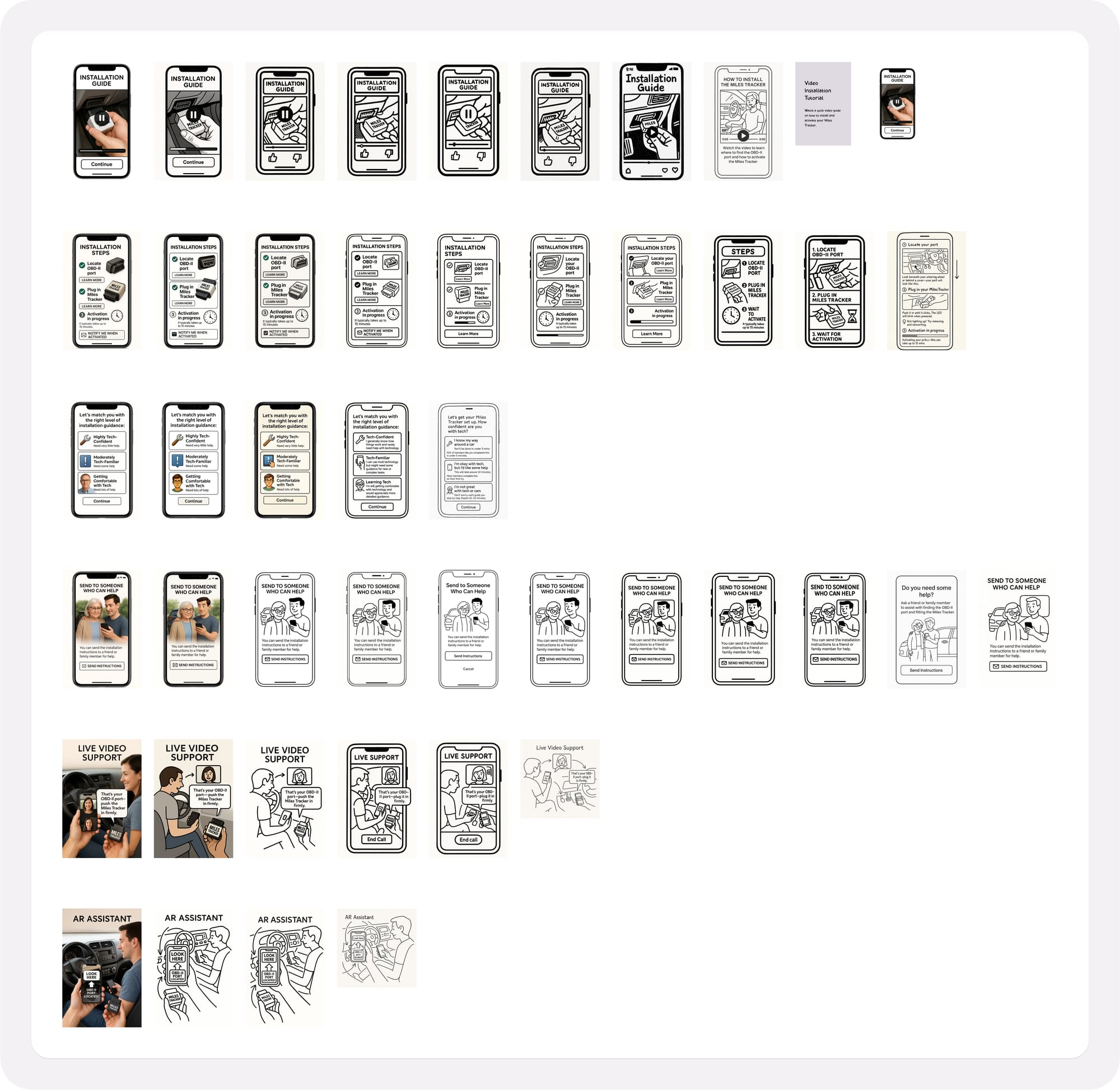
I generated ideas across the full spectrum — from simple enhancements like video tutorials and clearer microcopy, to more ambitious concepts like AR-assisted Tracker location and live video installation support. Each was documented with a description, hypothesis, and measurable success criteria before anything was tested.
To prioritise without anchoring the team to polished concepts, I ran Sacrificial Concept Testing — sharing deliberately rough ideas to spark honest reactions and avoid premature attachment to any single direction.
I hand-sketched initial concepts before experimenting with Generative AI to visualise directions faster. A useful accelerant — but one that rewards ruthless timeboxing. The instinct to refine AI output is real, and it can eat time that's better spent in front of real users.
Six Drivers. Two Cohorts. Four Insights That Shaped Everything.
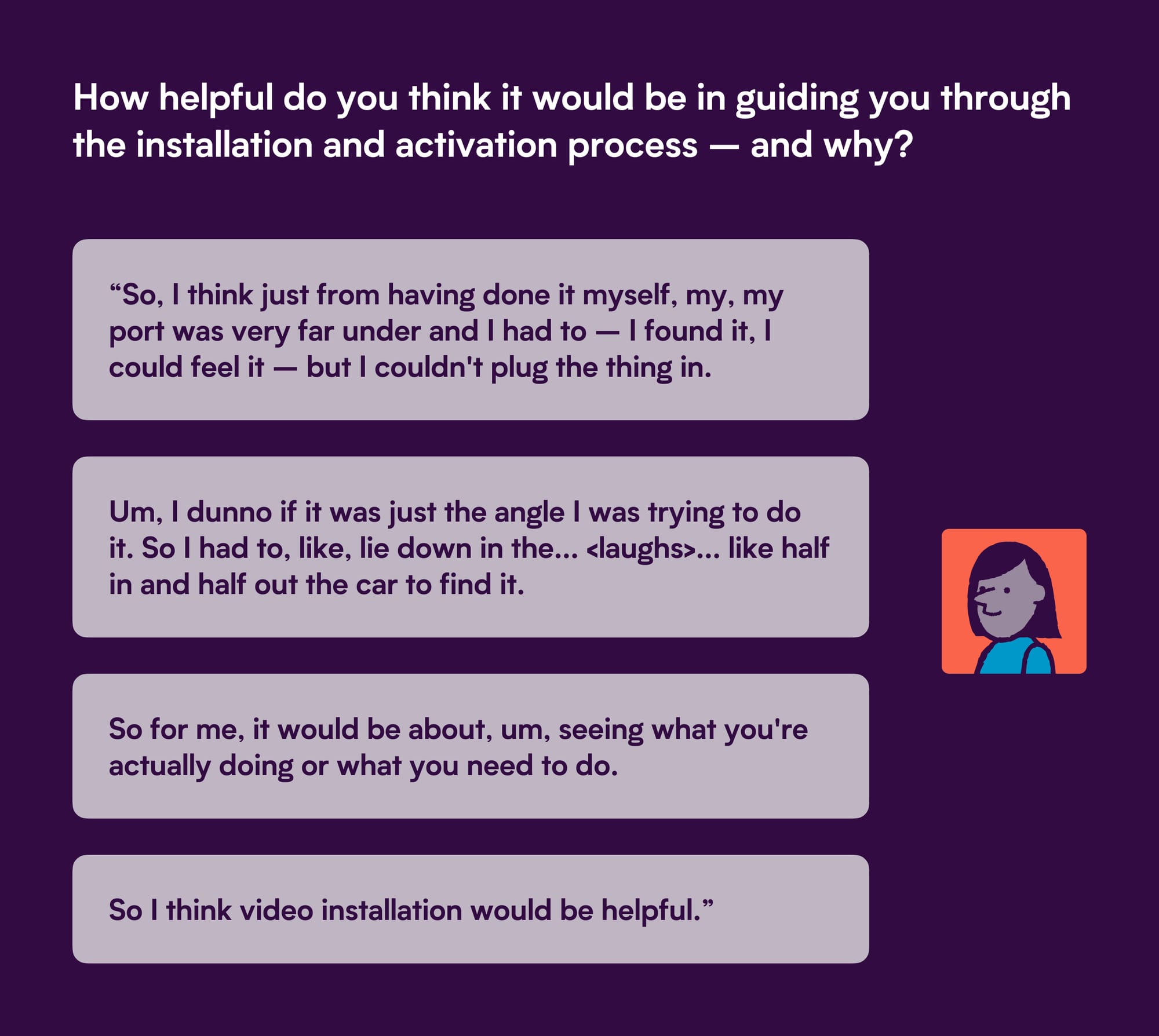
To pressure-test concepts with real drivers, I ran a remote unmoderated study via UserTesting with six participants — split between those with under 25 years' driving experience and those with 25 or more — to identify whether confidence and expectation varied by experience level.
What stood out across both groups:
- Video tutorials were the strongest performer — building confidence and giving users control over the pace of setup.
- Live video support was valued as a last resort, not a first step — human reassurance mattered most when self-serve had already failed.
- AR divided opinion — appealing in concept, doubted in practice, particularly among less tech-confident participants.
- Choice overload increased friction — personalisation only worked when it felt invisible.
The direction was clear: members needed to feel in control, informed, and supported — without being overwhelmed.
Two Rounds. Five Problem Statements. One Breakthrough.
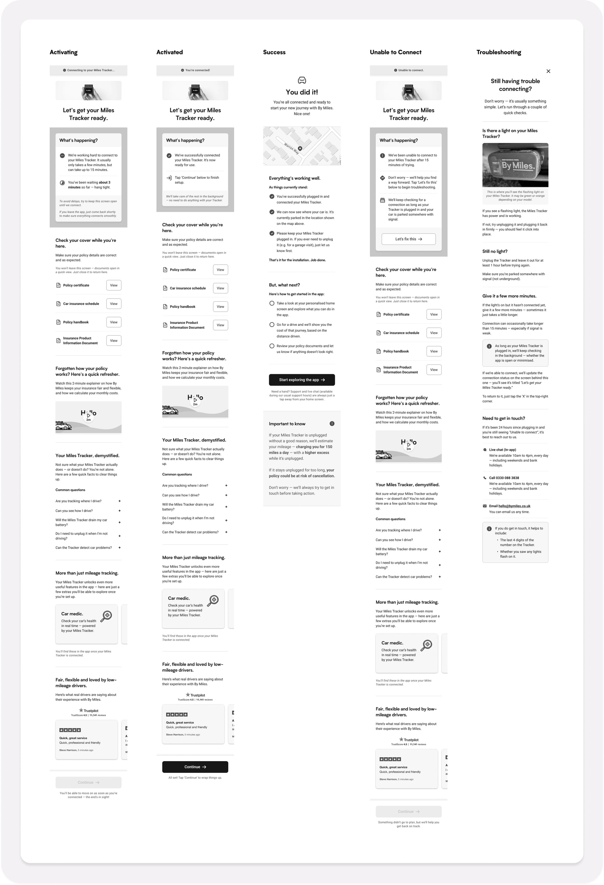
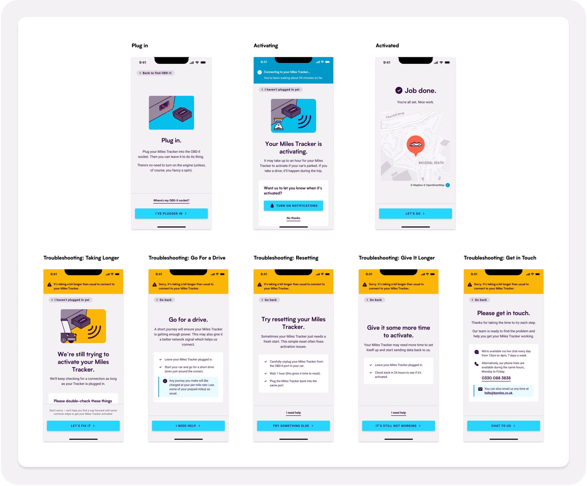
I created low- to mid-fidelity prototypes mapped to each of the five problem statements, running two rounds of user testing before driving the designs to a point where our Product Designer could take them to high-fidelity.
The most significant breakthrough came from the "Hold tight" screen. Renaming it "Connecting…" was a small change — but redesigning it around transparency and reassurance was not. Research showed:
- Real-time progress updates — "You've been waiting X minutes" — reduced uncertainty and built trust.
- Short, focused content consistently outperformed scrollable screens.
- Visual celebration moments — tick icons, simple animations — created emotional closure at a critical point in the journey.
- Live Tracker location on a map gave members concrete proof the device had connected.
Simplicity created confidence. Transparency created trust.
Releasing with Intent
I championed an incremental rollout over a single launch — starting in June 2025, releasing in stages, and refining as evidence accumulated.
The impact extended beyond the release. The team stopped treating onboarding as a static journey and started treating it as a living, measurable system.
What Changed — and What Didn't
The primary results were tangible:
- Abandonment from the "Hold Tight" screen fell by 12 percentage points — from the high-50s to the mid-40s.
- Onboarding completion times improved as clearer messaging helped members reach activation faster.
- CX reported fewer repeat queries and less confusion from members in the first weeks post-launch.
Macro-level results told a more complex story — and that complexity matters:
- Comprehension-related cancellations dipped quarter-on-quarter but remained stable year-on-year, pointing to structural issues beyond the app.
- Support requests within 30 days of purchase dropped by 6–7% quarter-on-quarter, though seasonality made longer-term trends harder to isolate.
The honest conclusion: the redesign demonstrably improved confidence and clarity. But the secret shopper work evidenced that terminology, support handovers, and after-hours availability were just as influential on member confidence as anything in the app — and those require cross-functional solutions, not design fixes.
Lessons and Principles
This project reinforced that the most valuable research often happens outside the interface — in driveways, live chat windows, and unlabelled packages.
What I'd do differently:
- Bring Marketing and CX into discovery earlier.
- Pair analytics with longitudinal research to track confidence over time.
- Timebox AI use for concept generation more ruthlessly.
- Focus on system- and service-level fixes from the outset, not just interface improvements.
What I'd do again:
- Order the device. Sit in the car. Contact support. Nothing replaces end-to-end first-hand experience.
- Use sacrificial concepts to surface honest reactions early.
- Champion incremental releases over big reveals.
The biggest lesson: systemic confidence problems need systemic solutions. Research can diagnose them. Only cross-functional alignment can fix them.