The Headlines
£135m protected. 9.1% sales drop avoided. 37% more category engagement delivered.
Leadership wanted the burger menu. Every premium retailer they admired had one. Three rounds of A/B testing proved them wrong.
A Proven Alternative. A Sceptical Leadership. A Case That Needed Making.
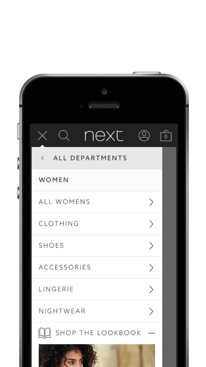
The burger menu (the ☰ icon that hides all navigation behind a single tap) was everywhere in 2017. Next's leadership wanted it too. My alternative was the 'Snail Trail', a name I coined for Next's horizontal scrolling navigation bar, where tapping a category reveals the next level of links in a visible, persistent trail. It had already delivered results in 2015, but leadership needed more than historical data to be convinced.
The Snail Trail Had Already Delivered. I Backed It Again.
The Snail Trail had form. In 2015, inspired by Microsoft's Metro design language, it delivered 50–70% higher click-throughs and a 0.5 percentage point conversion uplift over the previous navigation. Two years later, leadership wanted to abandon it for the burger menu trend. I was convinced that would cost Next dearly, and I intended to prove it.


The Research Had a Clear Winner. The Director Had a Different Agenda.
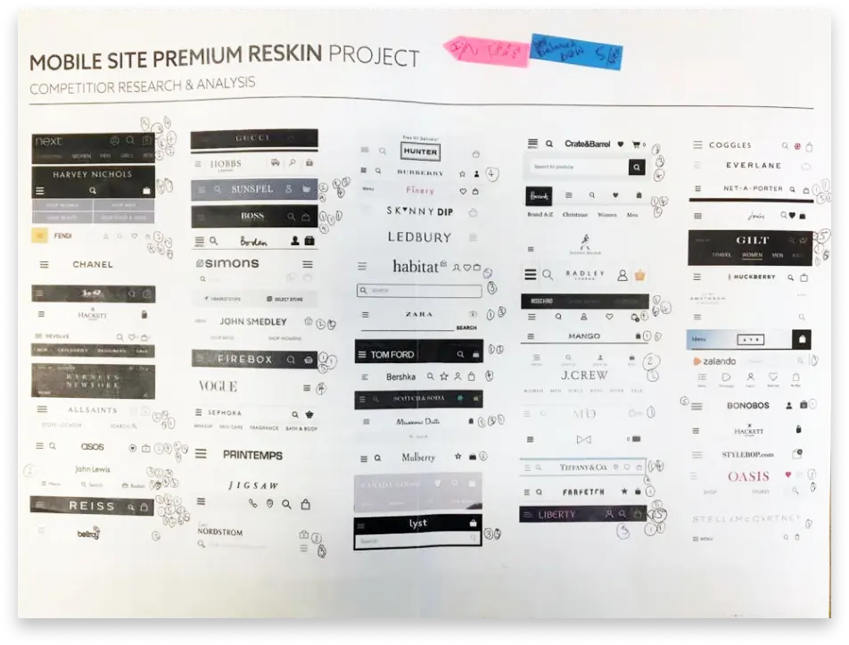
I benchmarked 70+ premium retail sites, from Chanel to ASOS. I then took the research off the screen, turning office walls into a gallery of navigation headers and inviting the wider business to vote. Reiss, ASOS, John Lewis and Hugo Boss consistently drew the most attention, their navigation visible and minimal. But the benchmarking findings weren't driving the decision.
The pressure to follow the trend wasn't coming from user research or commercial data. A newly appointed Director of Ecommerce, fresh from Boots, was driving a rapid repositioning of Next as a more premium brand before he'd had time to understand who Next's customers actually were, or what they responded to. The burger menus used by the brands he admired were part of that vision. Internal votes split 51/49. I was pushing back almost alone, armed with two years of behavioural data and the conviction that Next's customers should have the final say. Not our Director's wishlist.
Opinions Split. Real Traffic Decided.
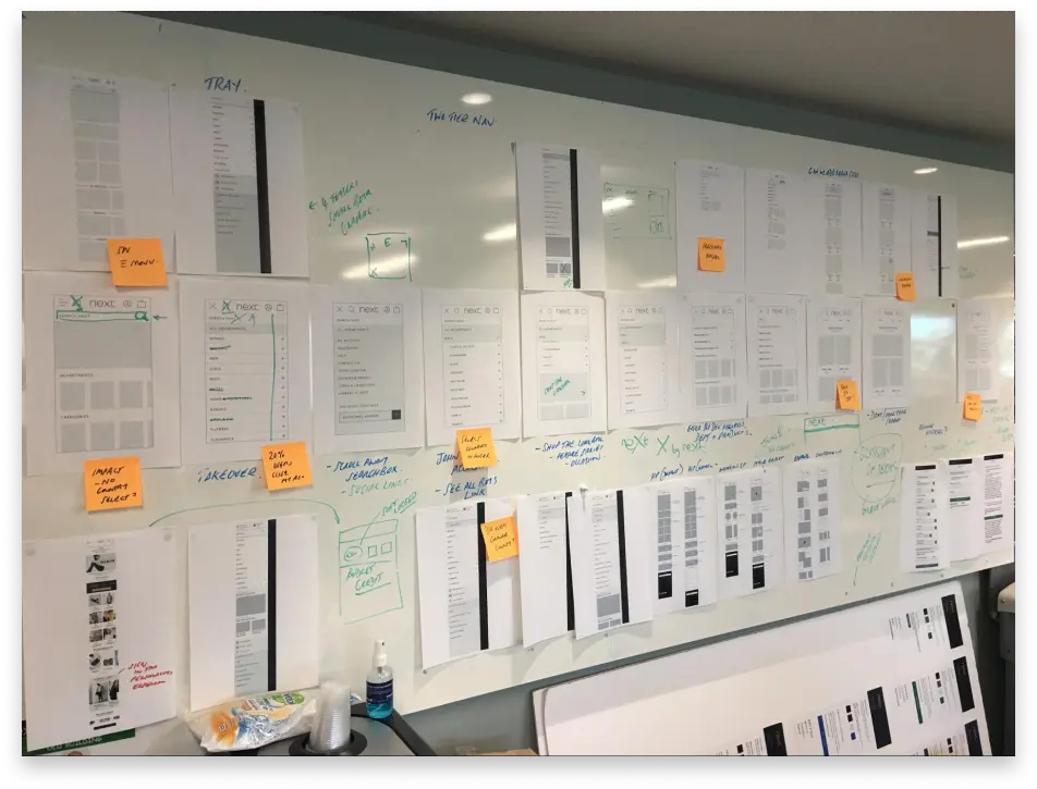
Staff polls and guerrilla tests were inconclusive. I needed proof, not indicators. I ran three rounds of live A/B testing, allocating 20% of traffic to each variant. What users did with the navigation mattered far more than what they said about it.
£135m Protected. 9.1% Sales Drop Averted.
The burger menu underperformed on every metric:
- Sales Revenue: Down 9.1%
- Conversion Rate: Down 0.35 percentage points
- Average Order Value: Down £2.38 per order
- Category Engagement: 53% to 72% fewer taps on Women, Men, Home, Christmas
Had the burger menu launched, Next would have faced an estimated £135m shortfall over 10 months. Leadership accepted the findings. The Snail Trail stayed.
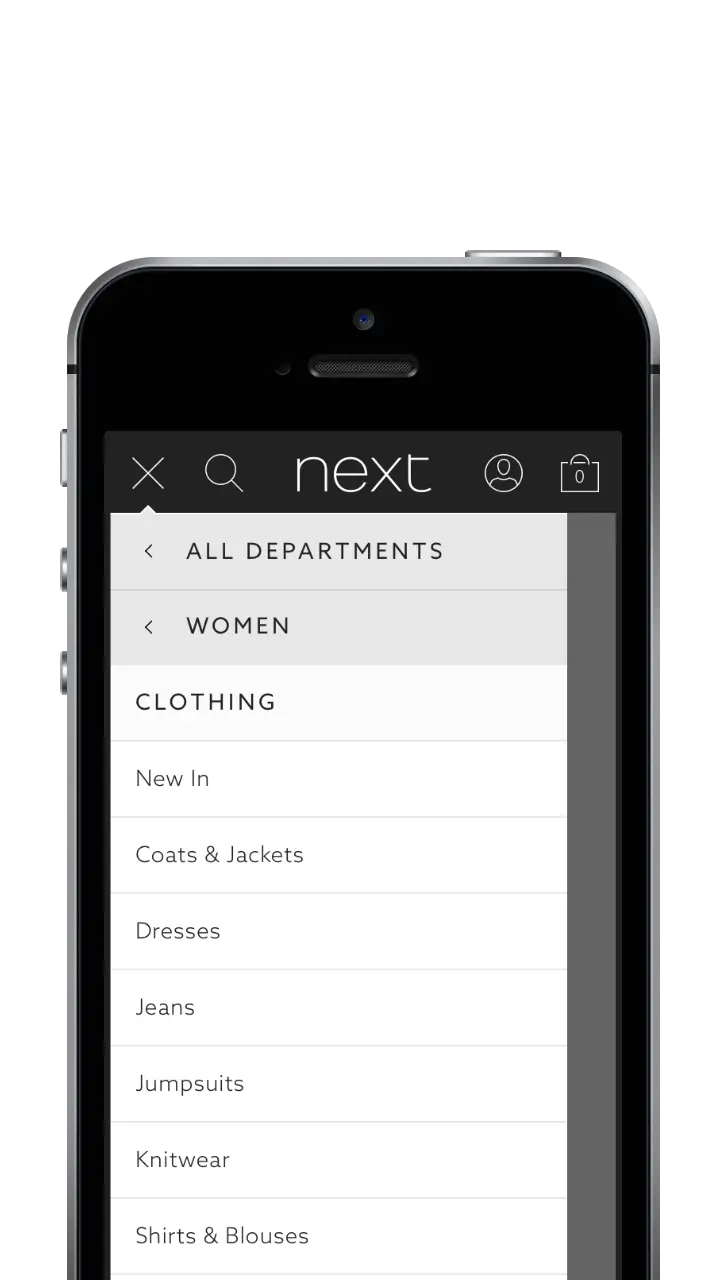
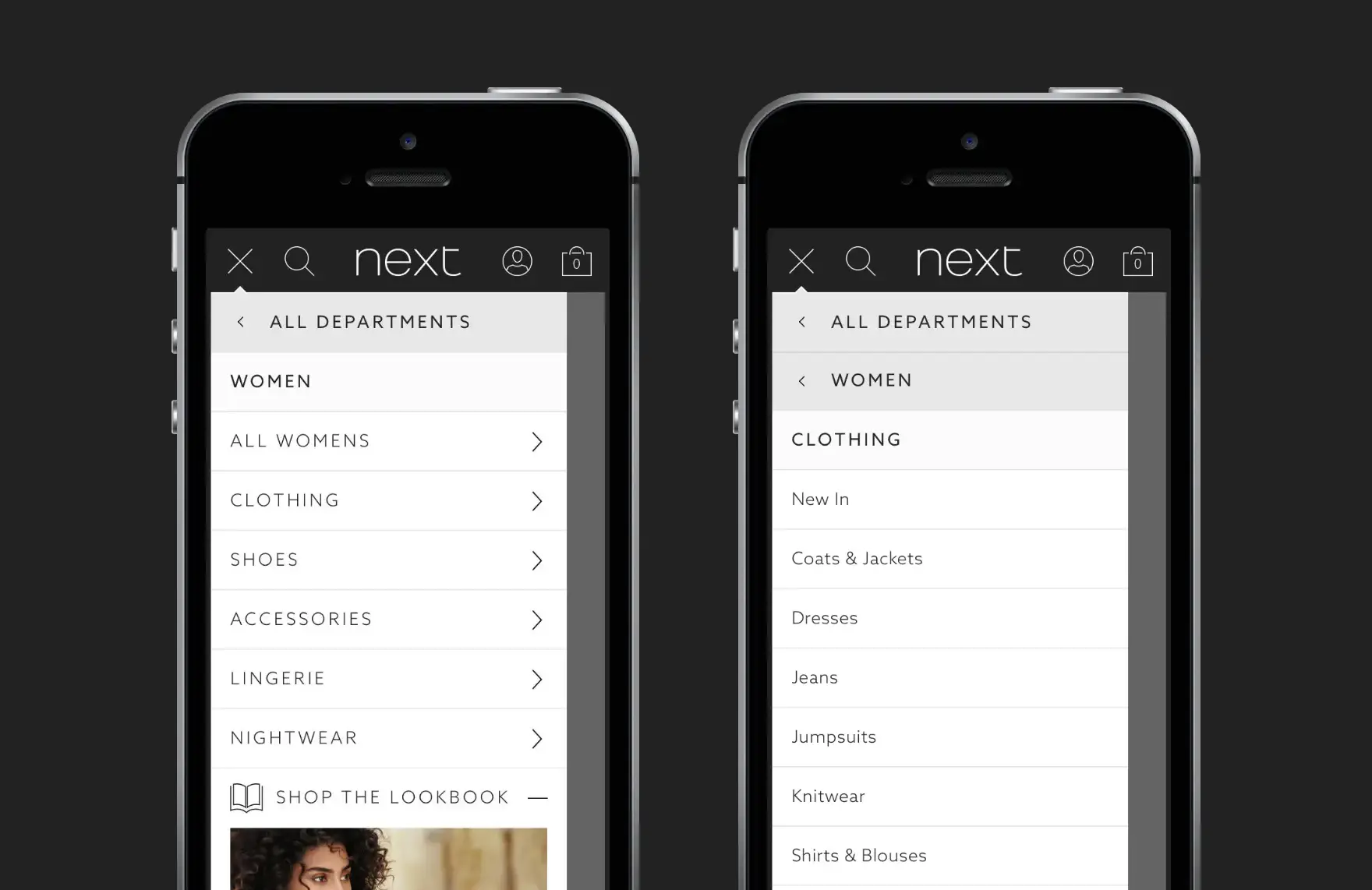
The burger menu required two taps just to reach clothing subcategories. Every additional tap was a potential exit point.
What This Taught Me
The hardest part wasn't running the tests. It was the moment after the first round, when the data was clear but leadership resisted it. In hindsight, I'd have been more forthright with the initial results and less willing to run further rounds simply to satisfy organisational resistance. Evidence alone doesn't drive decisions. The ability to read an organisation, bring stakeholders with you, and time your recommendations is as important as the research itself.
Evidence Beats Ego
The lesson from this project wasn't about navigation. It was about what happens when data challenges leadership instinct, and whether I had the conviction to see it through. UX isn't about following trends. Evidence beats ego. Every time.